Thursday 20 August 2015

Color Me Addams Family

I love the old Addams Family episodes from the 1960s. They're elegant and subversive and – for my money – remain fresh and smart and occasionally laugh-out-loud funny in a way that few shows manage 50 years on. I recently colorized some of the show's opening titles for my own amusement, based on colour set photos and research, for reasons no more sinister than something done in the spirit of fun and to give an approximation of what that remarkable set and cast actually looked like in real life. Since it's attracted a certain amount of online comment – good and bad – I'd thought I'd explain some of the thinking behind it and how it was put together.


Had The Addams Family lasted another year, it would have gone into colour, no question. And, compared to the majority of its 60s TV peers, The Addams Family would have been a very different beast for making the transition. Without a doubt, black and white allowed the Addamses to be zany, yet retain a degree of elegance in their demeanor that belied some of the broader humour. It gave a visually wacky show an air of the sardonic and made what was, literally, a live action cartoon surprisingly graceful and sophisticated. Contrary to popular belief, the Addams house had been designed with colour in mind. For the unaired pilot – a few shots of which were used in the titles – the crew filmed on a re-dressed mansion set built for The Unsinkable Molly Brown. Decorated with bright red wallpaper, this was really the starting point for the show's visuals, and the soundstage built for the show proper at General Service Studios was heavily based on it. For the actual series, the funhouse aspect was ramped up considerably, but not without a degree of good taste. Looking at surviving colour photographs, the clashing wallpapers and bizarre props are outlandish, but display style and harmony, and possibly gave a whole generation a lingering penchant for eclectic interior design in the process.

After recently reacquainting myself with Adobe Creative Suite's video software, I thought I'd give colorizing the show's titles a go, having wondered for years how it might look. Throughout, I chose to keep my own creative intrusions to a minimum. Between colour publicity stills, ViewMaster reels and other sources, it's possible to accurately identify the majority of the colours, and I looked at other Filmways TV shows of the same era to see how they approached colour lighting to lend added authenticity. My main liberty taken was on the opening artwork of the mansion – an uncredited piece by Addams creator Charles Addams, fact fans. This had been executed in black and white and would likely have either been redone for a colour switch or replaced by the matte painting of the house used on the show's establishing shots. Since a black and white surround on the shots jarred horribly, I decided to colour it up, basing the design on Charles Addams' occasional colour paintings, taking the pink sky from the Homebodies cover, the Addams book of cartoons that inspired producer David Levy to pitch the TV show. This also had the advantage of reflecting the magentas and jade greens of the living room decor, and – like that set – I used yellow as an accent colour for things like the logo, actor credits and Morticia's roses, based on those distinctive drapes that hung in the doorways. Incidentally, a lot of opticals for early colour shows were done in yellow as it gave an extra colour 'hit' while still registering as white for those still watching in black and white.

The frames themselves were coloured one-by-one in Photoshop, in a process that was predictably labour-intensive and slow to complete. The entire 48-second opening sequence consists of 1409 individual frames and I colorized over 1100 of them. One breakthrough in the execution of the colour itself came when I realised that by aggressively grading shots using the Photoshop curves function, one could take relatively flat, undetailed areas of colour and inject them with a variation of tone which helped make things look much more convincing, particularly on skin tones and highlights. I'd tried this technique before when colorizing single still frames, but here I developed it further, using individual curves for each of the different RGB colour channels, which produced more sophisticated results. Another revelation came from using the master RGB curve on a colour-blend setting, which allowed me to push the intensity of colour across different areas of shading without altering the tonal range of the underlying black and white image.

All this helped make the workload much more manageable on a frame-by-frame basis. For example, the grading works well on neutral objects, such as the window frames in the conservatory, which display subtle variations of cream, pink and blue in their shading, but are actually coloured with a simple flat grey wash. I worked on the sequence, off and on, for a month or so in my spare time, and may well tackle the remaining frames some day. I made it midway through the shots of Lurch at the harpsichord and Gomez filing the gates, so an update may follow eventually.


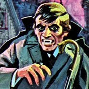
For now, I'm happy for it to stand as a little glimpse of Addams Family in colour and hopefully something that brings the original show to mind with fondness. Put simply, it's a tribute, not a replacement. Having scrutinised the shots to an almost forensic level, I've loved noticing little details like Carolyn Jones' playful little smirk on her second finger snap or John Astin counting down to his cue under his breath for his close-up. The people flicker into life and the shots themselves reveal little surprises, such as Morticia's African strangler lurking in the Kitty shot (yes, Cleopatra really was red), many of which which simply don't register in black and white. I prefer the original too, but I do think it's intriguing – albeit briefly – to see the actors live and breathe without the veil of black and white and glimpse that fabulous set in all its pop art glory. I've tried to do something respectful, authentic and hopefully a little fun too. I hope it's taken in the spirit in which it is intended.

Away from colouring old TV, I work as a designer and illustrator. You can see more of my work on my Facebook and Flickr pages

Thursday 29 December 2011

South London at Christmas

Here are some photographs from a stroll I took around south London this week. I like the patchwork parts of the area – the little eccentric fixes and make-do repairs that become invisible in time, but viewed in isolation are either strange, resourceful or inventive. The last picture is a nativity scene made from toys that I found in a window on a street in Deptford. I've walked past it dozens of times and I'm still not sure what the building is – is it a shop, a business or someone's home?


Tuesday 11 January 2011

Retro Doctor Who


Just before Christmas, I designed some wallpapers for the BBC's Doctor Who website, which have just gone live. I love retro typography and creating pastiche designs, so being able to put a classic spin on some of the recent stories was a dream job.

The idea was to produce imaginary movie posters in styles that reflected aspects of the stories. So, the online story Snowfall received a painterly Brief Encounter-style 40s look; the comic tone of The Lodger lent itself to a 70s sitcom spin-off treatment, and so on. The Hungry Earth was a deliberately lurid Hammer horror pastiche, based on a brilliant classic poster for Dracula, Prince of Darkness, and finally Victory of the Daleks had a touch of pop art, reflecting the new Dalek designs and the 60s Peter Cushing movies.

The designs can be downloaded as desktop wallpapers and as a screensaver by clicking here.


Monday 5 April 2010

Goodbye City Life

Green Acres is the place to be, apparently. It's a 1960s US sitcom and a little TV gem that had otherwise passed me by until now. I guess it was shown in the UK at some time, but over here it's a show which has pretty much fallen under the collective radar.

On the surface, Green Acres is a pretty humdrum reversal of The Beverly Hillbillies, produced by the same studio. Uptight lawyer Oliver Wendell Douglas, tiring of city life and the rat race, leaves Manhattan for rural Hooterville and and a new calling as a farmer. Along the way, he's accompanied by his glamorous Hungarian bride, Lisa, and a ragbag bunch of local eccentrics. So far, so good...

I'm assuming that was the pitch, but the show itself is something altogether different. It's very funny, until you start thinking about any of it. My mistake. Watched on the insomniac late shift, Green Acres resembles an episode of The Prisoner with a laugh track. Rather than finding nirvana, instead poor Oliver is trapped in an unsettling world of lunatics, fighting to retain his sanity as the local residents sleepwalk through a maze of mind games.

Two seasons in, and I'm now genuinely troubled by Oliver's plight. Whether it's wife Lisa reading him the episode's writer credits off of a hotcake, or characters listening suspiciously to the incidental music, Oliver's the last sane man standing, fighting an inexorable losing battle. His catchphrase is an exasperated "Whaaat?!?!" delivered unfailingly as he's presented with the latest assault on his sanity.

Luckily, the show has Vic Mizzy providing the score, which prevents it from being totally harrowing; That man could make an abbatoir sound welcoming. Cute musical riffs aside, I still can't work out if it's all brilliantly surreal or just deeply disturbing. Case in point are the Ziffels, an elderly childless couple, bringing up Arnold the pig as a substitute son. Very droll, but something in Fred's sad, rheumy eyes tells a different tale. What strange, untold tragedy befell this pair?

Watched during daylight hours, I imagine it all seems much cheerier. In the meantime, I await more troubling developments from this strange community.

Monday 28 December 2009

Belatedly...


...Merry Christmas! Bit of a Mad Men vibe this year, so best enjoyed with a hi-ball and a soundtrack by Peggy Lee.

Sunday 8 November 2009

Cuckoo

Here's a digital doodle I did this week for a friend's birthday, inspired by Mathias Malzieu's novel The Boy with the Cuckoo-Clock Heart. The book is a wonderful twisted adult fairy tale, featuring an outcast child kept alive by clockwork, with plenty of dark humour and a gleeful gothic bent. Quite unwittingly, my version seems to feature a Harold and Maude era Bud Cort in the title role, but since he'd have been pretty much perfect casting, I don't mind that at all.